About
The author
My name is Zacky Ma. I’m a web developer who enjoys drawing and loves Disney. I’m passionate about Web Standards and Inclusive Design.
The design
I grew up in the far west part of mainland China, and the internet wasn’t a thing until I was in high school. So Disney was my window to the outside world. My love for Disney has driven me through almost all significant changes in my life. So I weaved that love into the design of this website.
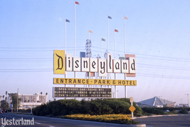
I designed the website logo as the old Disneyland park entrance sign.

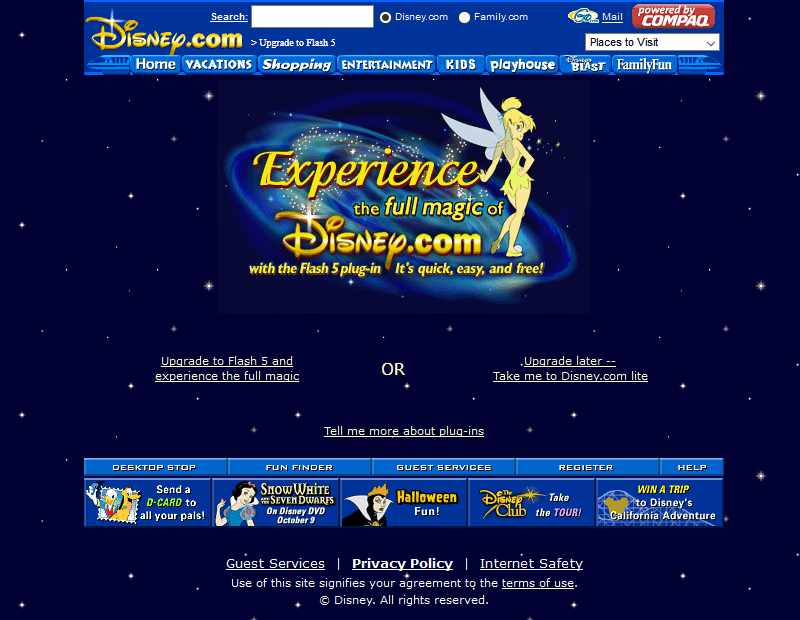
The navigation in the header is a tribute to my favorite Disney.com design (circa the early 2000s): the main navigation was a monorail referencing the famous Disney Park monorail systems. I thought it was a clever idea for the brand continuation to bring the Disney magic from the real world to the online world.

Unlike today, it was a time when websites looked all different from each other, the web design was more experimental and interesting. It seems the industry is trending in that direction again. Hopefully, the web will look more diverse in a few years without repeating Flash’s closeness, lack of security, and poor accessibility.
The dark mode design is inspired by Disneyland’s classic Main Street Electrical Parade.
The assets
The monospace fonts used in all code samples belong to the font family called Mono Lisa. The primary logotype (“MarchBox”) uses Parkly, made by the great SimpleBits. I like that each letter has friendly rounded edges while maintaining a square shape, the friendliness fits the Disneyland vibe, and the square shape fits the logo design. Plus, the name! The secondary logotype uses Asap Condensed.
The website is built with the Node.js-based static site generator, Eleventy. I like its simplicity and flexibility.
The copyrights of all characters in the drawings belong to their original copyright owners, this includes but not limited to Disney, Disney/Pixar, Marvel, and Lucasfilm.
Contact
- Email: zacky@marchbox.com
- Mastodon: @zacky@marchbox.com
Subscribe
- All posts (Atom)
- Articles only (Atom)
- Drawings only (Atom)